Osfast is a one-person business focused on helping older adults and small businesses with whatever they need. By offering dependable and caring help, Osfast makes everyday jobs simpler.
Build a brand image and media plan that clearly shows what makes Osfast special to older adults, small businesses, and future clients by offering real, practical solutions.
To begin developing Osfast’s brand identity, I first searched for creative direction. I gathered images and ideas that reflected the heart of the brand and assembled them into a mood board. This helped shape a set of visual themes, or stylescapes, that captured Osfast’s personality. Throughout the process, I met with Oscar and included the fonts and colors he preferred. Once the look and feel were defined, I also helped creating a brand guide to clearly express Osfast’s mission and its focus on supporting older adults and small businesses with everyday challenges.
I started by reviewing Osfast’s current design and how it was presenting itself. After that, I looked into how other similar businesses share their brand and connect with their audience. Using what I learned, I figured out which social media platform would suit Osfast best. I also explored how having a website could strengthen its image and make its overall presence more effective.
After completing the mood board and stylescape, the team met with Oscar to decide on the visual direction.
We chose white and shades of blue as the main brand colors, which reflected Osfast’s energy and friendly approach.
During the meet, we also had a photoshoot where I suggested a few pose ideas that Oscar ended up really
liking, especially for how they would look on his website. It was a fun and relaxed session that also gave me
a chance to get to know him better, which helped shape the brand more personally.
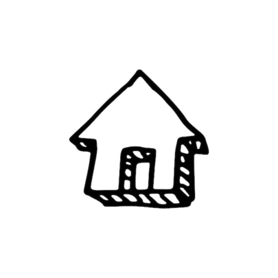
So to enhance the design more i wanted to add fun doodles that represent him in a friendly manner. These doodles could
also have the function of filling up the pages if they have an empty feel to it.
Throughout the design process, the logo went through several revisions based on ongoing feedback.
In the final presentation, in which i presented alongside Gabriel, Oscar picked the version he felt represented Osfast best, and that became the main logo.
He really liked how the doodles add a playful and functional effect.
From my part it went well especially when it came to just getting things done but I feel like I haven’t really done much as a leader for my leadership skills. I did send reminders or such but when it came to proper communication, the group did lack some of it. Regardless the doodles were fun to work on and even the brand guide. Next time I want to have stronger leadership skills and even put roles on everyone in the group to avoid further confusion.
Click here to view the following: